Setup Score OscillatorSetup Score Oscillator – Full Description
🎯 Purpose of the Script
This script is a manual trading setup scoring tool, designed to help traders quantify the quality of a trade setup by combining multiple technical, cyclical, and contextual signals.
Instead of relying on a single indicator, the trader manually selects which signals are present, and the script calculates a total score (0–100%), displayed as an oscillator in a separate panel (like RSI or MACD).
🔧 How it works in practice
1. Manual signal inputs
The script presents a set of checkboxes in the settings, where the trader can enable/disable the following signals:
✅ Confirmed Support/Resistance
✅ Aligned Volume Profile
✅ Favorable Cyclic Timing
✅ Valid Trend Line
✅ Aligned Cyclical Moving Averages
✅ Relevant Fibonacci Level
✅ Classic Volume Signal (spike, dry-up, etc.)
✅ Oscillator confirmation (e.g., divergences)
✅ Extreme Sentiment
✅ Relevant or incoming News
Each selected signal contributes to the total score based on its weight.
2. Scoring system
Each signal has a default weight (e.g., 20% for support/resistance, 15% for cycles, etc.).
Optionally, the trader can enable the “custom weights” checkbox and adjust each signal’s weight directly in the settings.
3. Score visualization
The final score (sum of all active weights) is plotted as an oscillator ranging from 0 to 100%, with dynamic coloring:
Range Color Meaning
0–39% Red No valid setup
40–54% Yellow Watchlist only
55–69% Orange Good setup
70–100% Green Strong setup
Several horizontal threshold lines are displayed:
50% → neutral threshold
40%, 55%, 70% → operational levels
4. Optional background coloring
When the score exceeds 55% or 70%, the oscillator background lightly changes color to highlight stronger setups (non-intrusive).
📌 Practical benefits
Objectifies subjective analysis: each decision becomes a number.
Prevents overtrading: no entries if the score is too low.
Adaptable to any trading style: swing, intraday, positional.
User-friendly: no coding needed – just tick boxes.
Italiano:
Setup Score Oscillator – Descrizione completa
🎯 Obiettivo dello script
Lo script è uno strumento manuale di valutazione dei setup di trading, pensato per aiutare il trader a quantificare la qualità di un'opportunità operativa basandosi su più segnali tecnici, ciclici e contestuali.
Invece di affidarsi a un solo indicatore, il trader seleziona manualmente quali segnali sono presenti, e lo script calcola un punteggio complessivo percentuale (0–100%), rappresentato come oscillatore in una finestra separata (tipo RSI, MACD, ecc.).
🔧 Come funziona operativamente
1. Input manuale dei segnali
Lo script mostra una serie di checkbox nelle impostazioni, dove il trader può attivare o disattivare i seguenti segnali:
✅ Supporto/Resistenza confermata
✅ Volume Profile allineato
✅ Cicli o timing favorevole
✅ Trend line valida
✅ Medie mobili cicliche allineate
✅ Livello di Fibonacci rilevante
✅ Volume classico significativo (spike, dry-up)
✅ Conferme da oscillatori (es. divergenze)
✅ Sentiment estremo (es. euforia o panico)
✅ News importanti imminenti o appena uscite
Ogni casella attiva contribuisce al punteggio totale, con un peso specifico.
2. Sistema di punteggio
Ogni segnale ha un peso predefinito (es. 20% per supporti/resistenze, 15% per cicli, ecc.).
Facoltativamente, il trader può attivare la funzione “Enable custom weights” per personalizzare i pesi di ciascun segnale direttamente da input.
3. Visualizzazione del punteggio
Il punteggio complessivo (somma dei pesi attivati) viene tracciato come oscillatore da 0 a 100%, con colori dinamici:
Range Colore Significato
0–39% Rosso Nessun setup valido
40–54% Giallo Osservazione
55–69% Arancione Setup buono
70–1005 Verde Setup forte
Sono tracciate anche delle linee guida orizzontali a:
50% → soglia neutra
40%, 55%, 70% → soglie operative
4. Colorazione dello sfondo (facoltativa)
Quando il punteggio supera 55% o 70%, lo sfondo dell’oscillatore cambia leggermente colore per evidenziare il segnale (non invasivo).
📌 Vantaggi pratici
Oggettivizza l’analisi soggettiva: ogni decisione manuale si trasforma in un numero.
Evita overtrading: se il punteggio è troppo basso, non si entra.
Adattabile a ogni stile: swing, intraday, position.
Facile da usare anche senza codice: basta spuntare le caselle.
Cerca negli script per "volume profile"
Volume Flow RatioVolume Flow Ratio (VFR) Indicator
Overview
The Volume Flow Ratio (VFR) is a sophisticated volume analysis tool that measures current trading volume relative to the maximum volume of the previous period. Unlike traditional volume indicators that show raw volume or simple moving averages, VFR provides context by comparing current activity to recent maximum activity levels.
Core Features
1. Split Period Analysis
- Multiple Timeframe Options:
- Daily: Compares to previous day's maximum
- Weekly: Week-to-week comparison
- NYSE Weekly: Specialized for stock market trading (Monday-Friday only)
- Monthly: Month-to-month analysis
- Quarterly: Quarter-to-quarter perspective
- Yearly: Year-over-year volume comparison
2. Ratio-Based Measurement
- Displays volume as a ratio (0 to 1+) rather than raw numbers
- 1.0 represents volume equal to previous period's maximum
- Example: If previous max was 50,000 contracts:
- Current volume of 25,000 shows as 0.5
- Current volume of 75,000 shows as 1.5
3. Triple Coloring Modes
- Moving Average Based:
- Compares current ratio to its moving average
- Customizable MA period
- Green: Above MA (higher than average activity)
- Red: Below MA (lower than average activity)
- Previous Candle Comparison:
- Simple increase/decrease from previous bar
- Green: Higher than previous bar
- Red: Lower than previous bar
- Candle Color Based:
- Syncs with price action
- Green: Bullish candles (close > open)
- Red: Bearish candles (close < open)
Primary Use Cases
1. Volume Profile Analysis
- Perfect for traders who need to understand when markets are most active
- Helps identify unusual volume spikes relative to recent history
- Useful for timing entries and exits based on market participation
2. Market Activity Traders
Ideal for traders who:
- Need to identify high-liquidity periods
- Want to avoid low-volume periods
- Look for volume breakouts or divergences
- Trade based on institutional participation levels
3. Mean Reversion Traders
Helps identify:
- Overextended volume conditions (potential reversals)
- Volume exhaustion points
- Return to normal volume levels after spikes
4. Momentum Traders
Useful for:
- Confirming trend strength through volume
- Identifying potential trend exhaustion
- Validating breakouts with volume confirmation
Advantages Over Traditional Volume Indicators
1. Contextual Analysis
- Shows relative strength rather than raw numbers
- Easier to compare across different time periods
- Automatically adjusts to changing market conditions
2. Period-Specific Insights
- Respects natural market cycles (daily, weekly, monthly)
- Special handling for NYSE trading days
- Eliminates weekend noise in stock market analysis
3. Flexible Visualization
- Three distinct coloring methods for different trading styles
- Clear reference line at 1.0 for quick analysis
- Histogram style for easy pattern recognition
Best Practices
For Day Traders
- Use Daily split for intraday volume patterns
- MA coloring mode with shorter periods (5-10)
- Focus on ratios during market hours
For Swing Traders
- Weekly or NYSE Weekly splits
- Longer MA periods (15-20)
- Look for sustained volume patterns
For Position Traders
- Monthly or Quarterly splits
- Candle color mode for trend confirmation
- Focus on major volume shifts
Limitations
- Requires one full period to establish baseline
- May be less effective in extremely low volume conditions
- NYSE Weekly mode specific to stock market hours
This indicator is particularly valuable for traders who understand that volume is a crucial component of price action but need a more sophisticated way to analyze it than simple volume bars. It's especially useful for those who trade based on market participation levels and need to quickly identify whether current volume is significant relative to recent history.

Ultimate Multi Indicator - by SachaThe Ultimate Multi Indicator: The Ultimate Guide To Profit
This custom indicator, the Ultimate Multi Indicator , integrates multiple trading indicators to have powerful buy and sell signals. I combined MACD, EMA, RSI, Bollinger Bands, Volume Profile, and Ichimoku Cloud indicators to help traders analyze both short-term and long-term price movements.
Key Components and How to Use Them
- MACD (Moving Average Convergence Divergence):
- Use for trend direction and potentiality of reversals.
- The blue line (MACD Line) crossing above the orange line (Signal Line) indicates a bullish reversal; the opposite signals a bearish reversal.
- Watch for crossovers to confirm the direction of smaller price movements.
- 200 EMA (Long) (Exponential Moving Average):
- Use to indicate a long-term trend direction.
- If the price is above the 200 EMA, the market is in an uptrend; below it suggests a downtrend.
- The chart’s background color shifts subtly green (uptrend) or red (downtrend) depending on the EMA's relative position.
- RSI (Relative Strength Index):
- Tracks momentum and overbought/oversold levels.
- RSI over 70 signifies overbought conditions; under 30 indicates oversold.
- Look for RSI turning points around these levels to identify potential reversals.
- Bollinger Bands :
- The price touching or crossing the upper Bollinger Band may mean overbought conditions are filled, while a touch at the lower band indicates oversold.
- Bollinger Band interactions often align with key reversal points, especially when combined with other signals.
- Volume Profile :
- A yellow VP line on the chart represents significant trading volume occurred.
- This line can be used as both a support and resistance level, and especially during consolidations or trend changes.
- Ichimoku Cloud :
- Identifies support/resistance levels and trend direction.
- Green and red cloud regions visually show if the price is above (bullish) or below (bearish) key levels.
- Price above the cloud (green) confirms a bullish market, while below (red) signals bearish.
Signal Conditions and Visualization
- Buy Signals :
- This is triggered right away when MACD crosses up, RSI is oversold, or price touches the lower Bollinger Band, provided price is above both the Ichimoku Cloud and the 200 EMA.
- A green “BUY” label appears below the bar, suggesting a potential entry.
- Sell Signals :
- This signal is generated when MACD crosses down, RSI is overbought, or price touches the upper Bollinger Band, and price is below the Ichimoku Cloud and the 200 EMA.
- A red “SELL” label is shown above the bar, indicating a potential exit.
Tips & Tricks
- Confirm Signals : Use multiple signals to confirm entries and exits. For example, if both the MACD and RSI align with the Ichimoku Cloud direction, the trade setup is stronger.
- Trend Directions : Only take buy signals if the price is above the 200 EMA, and sell signals if it is below, aligning trades with the overall trend.
- Adjust for Volatility : In high-volatility markets, especially in the crypto markets, pay close attention to the Bollinger Bands for breakout potential.
- Ichimoku as a Trend Guide : Use the Ichimoku Cloud as a guide for long-term support and resistance levels, especially for swing trades.
This multi-layered indicator gives a balanced blend of short-term signals and long-term trend insights, making it a versatile tool for day trading, swing trading, or even longer-term analysis.
Remember that indicators that will make you rich instantly don't exist. To expect minimum profit from them, you shouldn't trade all you have at the same time but only trade with the money you can afford to lose.
After that being said, I wish you traders luck with the Ultimate Multi Indicator!
VWAP RangeThe VWAP Range indicator is a highly versatile and innovative tool designed with trading signals for trading the supply and demand within consolidation ranges.
What's a VWAP?
A VWAP (Volume Weighted Average Price) represents an equilibrium point in the market, balancing supply and demand over a specified period. Unlike simple moving averages, VWAP gives more weight to periods with higher volume. This is crucial because large volumes indicate significant trading activity, often by institutional traders, whose actions can reflect deeper market insights or create substantial market movements. The VWAP is also often used as a benchmark to evaluate the efficiency of executed trades. If a trader buys below the VWAP and sells above it, they are generally considered to have transacted favourably.
This is how it works:
Multiple VWAP Anchors:
This indicator uses multiple VWAPs anchored to different optional time periods, such as Daily, Weekly, Monthly, as well as to the highest high a lowest low within those periods. This multiplicity allows for a comprehensive view of the market’s average price based on volume and price, tailored to different trading styles and strategies.
Dynamic and Fixed Periods:
Traders can choose between using dynamic ranges, which reset at the start of each selected period, and specifying a date and time for a particular fixed range to trade. This flexibility is crucial for analyzing price movements within specific ranges or market phases.
Fixed ranges allow VWAPs to be calculated and anchored to a significant market event, the beginning of a consolidation phase or after a major news announcement.
Signal Generation:
The indicator generates buy and sell signals based on the relationship of the price to the VWAPs. It also allows for setting a maximum number of signals in one direction to avoid overtrading or pyramiding. Be sure to wait for the candle close before trading on the signals.
Average Buy/Sell Signal Lines:
Lines can be plotted to display the average buy and sell signal prices. The difference between the lines shows the average profit per trade when trading on the signals in that range. It's a good way to see how profitable a range is on average without backtesting the signals. The lines will also often turn into support and resistance areas, similar to value areas in a volume profile.
Customizable Settings:
Traders have control over various settings, such as the VWAP calculation method and bar color. There are also tooltips for every function.
Hidden Feature:
There's a subtle feature in this indicator: if you have 'Indicator values' turned on in TradingView, you'll see a Sell/Buy Ratio displayed only in the status line. This ratio indicates whether there are more sell signals than buy signals in a range, regardless of the Max Signals setting. A red value above 1 suggests that the market is trending upward, indicating you might want to hold your long positions a bit longer. Conversely, a green value below 1 implies a downward trend.

All Support and Resistance Levels [PINESCRIPTLABS]First, we observe the Light Blue Macro Supports and the Pink Macro Resistances. These channels are automatically formed based on market data, identifying pivot points in price history and determining the strength of these levels based on the number of pivot points within these same channels. When the price interacts with the macro Supports, we have a strong reaction that we can take advantage of in two ways:
1. The first and most common, as we can see in the chart, is that these zones elicit a strong reaction, and the price respects the channel. For us, as traders, it signifies a pivot point where we can initiate a trade, either a buy at the macro Support or a sell at the macro Resistance.
2. The second way to use them, for which this algorithm is also prepared, is in case a movement occurs where the price breaks these Macro Supports or Macro Resistances. We have a special alert that will notify us because when these macro channels are broken, they tend to do so violently in a move that we can also capitalize on. Usually, when such a breakout occurs, we will visit the next support or resistance channel, which can bring us significant benefits.
The following complex and highly accurate calculation provided by this indicator allows us to work with price supports and resistances within the internal structure of macro channels. As we can see in the chart, "boxes" are formed that represent the detected support and resistance areas. It also detects breakouts when the price crosses below the support "box" or above the resistance "box" and displays labels on the chart indicating when the breakout occurred, all in real-time. But here comes something very special: the algorithm also has a calculation that, as we see in the chart, there are occasions when the breakout occurs, but the price returns to the support or resistance "box" and is detected. At this moment, a label appears on the chart indicating a possible confirmation of the breakout. In other words, as the price initially broke out but returned to the "box," the algorithm will notify us with another label and a special alert when the price confirms the breakout.
At the same time, we can see in the chart that the algorithm also provides us with a volume profile that allows us to see where the most trading activity has concentrated based on price levels. We can also use it to identify support and resistance levels based on the point of control (POC) and value area levels. As we can see in the chart, there are labels with the exact price where the highest volume was traded. The top label in the chart shows the highest price, and the last label we see is for the lowest price. These displayed labels are within the defined range of retrocession or Lookback Length, which we can configure in our indicator. As we observe, the algorithm shows a strong confluence between the Macro Support channels and the volume profile labels, confirming the strongest areas of the range.
Finally, after calculating supports and resistances from three different perspectives, the algorithm provides us with a macro view of the price in the form of trend lines. In other words, it shows us supports and resistances in the form of diagonal channels where we can see trends in the market and areas where the price has historically encountered difficulties in advancing or retreating, which we can corroborate with the supports and resistances mentioned at the beginning.
As we can see in the chart, the algorithm also shows us labels with the exact price where angular price supports and resistances are located. These calculations are very important as they provide a trend perspective, and we can get an idea of where the price is headed, combining these with the other support and resistance calculations.
Remember that all the previous calculations have their own alerts for when supports or resistances are broken, or in the case of new channels being created, also when there is a breakout of a box or a confirmation of a breakout.
The second type of alert from the indicator is configured to make our indicators work for us without the need to be present on the chart, thanks to special programming within the indicator's code. It will execute automatic buys and sells on our preferred exchange through an alert configured for the 3Commas bot. All you need to do is input your Bot ID, provided by 3Commas, into the alert. All premium indicators come with a configuration explanation that will guide you in detail on where to input your Bot ID.
ESPAÑOL:
En primer lugar, observamos los Macro Soportes en color azul claro y las Macro Resistencias en color rosa. Estos canales se forman automáticamente en función de los datos del mercado, identificando puntos de pivote en el historial de precios y determinando la fuerza de estos niveles según la cantidad de puntos de pivote dentro de estos mismos canales. Cuando el precio interactúa con los macro Soportes, tenemos una fuerte reacción que podemos aprovechar de dos formas:
1. La primera y más común, como observamos en el gráfico, es que estas zonas provocan una fuerte reacción, y el precio respeta el canal. Para nosotros, como traders, significa un punto de pivote donde podemos generar una entrada, ya sea de compra en el macro soporte o de venta en la macro resistencia.
2. La segunda forma de utilizarlos, para la cual este algoritmo también está preparado, es en caso de que se genere un movimiento en el que el precio rompa estos Macro Soportes o Macro Resistencias. Contamos con una alerta especial que nos avisará, ya que al romperse estos macro canales suelen hacerlo con violencia en un movimiento que también podemos aprovechar. Regularmente, cuando existe este rompimiento, visitaremos el siguiente canal de soporte o resistencia, lo que nos puede traer grandes beneficios.
El siguiente cálculo complejo y muy preciso que nos ofrece este indicador nos permite trabajar con soportes y resistencias del precio dentro de la estructura interna de los canales macro. Como observamos en el gráfico, se producen "boxes" que representan las áreas de soporte y resistencia detectadas. Además, detecta breakouts cuando el precio cruza por debajo del "box" de soporte o por encima del "box" de resistencia y muestra etiquetas en el gráfico que nos indican cuándo ocurrió el breakout, todo esto en tiempo real. Pero aquí viene algo super especial: el algoritmo también tiene un cálculo que, como vemos en el gráfico, hay ocasiones en las que el breakout ocurre, pero el precio retorna al "box" de soporte o resistencia y es detectado. En este momento, aparece una etiqueta en el gráfico que nos muestra que estamos ante una posible confirmación del breakout. Es decir, como el precio había hecho en primer lugar el breakout pero regresó al "box", el algoritmo nos avisará con otra etiqueta y alerta especial cuando el precio confirme el breakout.
Al mismo tiempo, observamos en el gráfico que el algoritmo también nos muestra un perfil de volumen que nos permite ver dónde se ha concentrado la mayor actividad de negociación en función de los niveles de precios. También podemos usarlo para identificar niveles de soporte y resistencia basados en el punto de control (POC) y los niveles de valor (Value Area). Como vemos en el gráfico, tenemos etiquetas con el precio exacto donde se negoció la mayor cantidad de volumen. La etiqueta superior del gráfico nos muestra el precio más alto, y la última etiqueta que observamos es la de la parte baja, que nos indica el precio más bajo. Estas etiquetas mostradas están dentro del rango de retroceso definido o Lookback Length, que podemos configurar en nuestro indicador. Como observamos, el algoritmo nos muestra una fuerte confluencia entre los canales de soporte Macro y las etiquetas del perfil de volumen, lo que nos confirma las áreas más fuertes del rango.
Por último, después de hacer los cálculos de soportes y resistencias desde tres perspectivas distintas, el algoritmo nos proporciona una visión macro del precio en forma de líneas de tendencia. Es decir, nos muestra soportes y resistencias en forma de canales diagonales donde tendremos representadas las tendencias en el mercado y áreas en las que el precio históricamente ha encontrado dificultades para avanzar o retroceder, lo que podemos corroborar con los soportes y resistencias de los que hablamos al principio.
Como observamos en el gráfico, el algoritmo también nos muestra las etiquetas con el precio exacto donde se encuentran los soportes angulares del precio y las resistencias angulares. Estos cálculos son importantísimos, ya que nos ofrecen una perspectiva de tendencia y podemos tener una visión de hacia dónde se dirige el precio, combinando estos con los otros cálculos de soportes y resistencias.
Recuerden que todos los cálculos anteriores tienen su propia alerta para cuando los soportes o resistencias se quiebren o en su caso, se creen nuevos canales, también cuando haya una ruptura de un "box" o una confirmación de ruptura.
El segundo tipo de alerta del indicador está configurada para que nuestros indicadores trabajen para nosotros sin necesidad de estar presentes en el gráfico, esto mediante una programación especial dentro del código del indicador que realizará compras y ventas automáticas en nuestro Exchange de preferencia mediante una alerta configurada para el bot 3Commas. Solo bastará con que pongamos nuestro número de Bot o Bot ID que da el proveedor de 3Commas y lo insertemos en la alerta. Todos los indicadores premium tienen en su configuración una explicación detallada sobre dónde poner tus Bot ID.
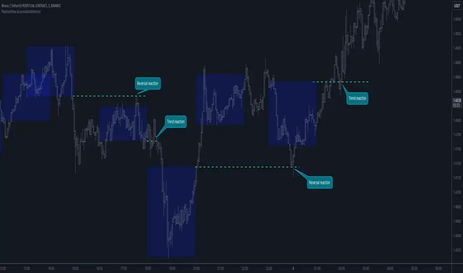
PhantomFlow AccumulationDetectorThe PhantomFlow AccumulationDetector indicator analyzes the volume profile and displays potential accumulation based on the selected timeframe in the settings. This indicator can be used both as zones for trend following and for identifying reversals, as shown in the examples on the chart. The logic behind the formation of the accumulation zone is based on the fact that the POC (Point of Control) of the current zone is within the Volume Area range of the previous period.
Optimal settings for the working timeframe should be chosen visually, and the size of the zones should not be too large or too small. Additionally, it's advisable not to consider overly wide zones during increased volatility.
Consecutive zones within the same range often indicate a potential reversal.
We borrowed the volume profile calculation code from @LonesomeTheBlue. Thank you for the work done!
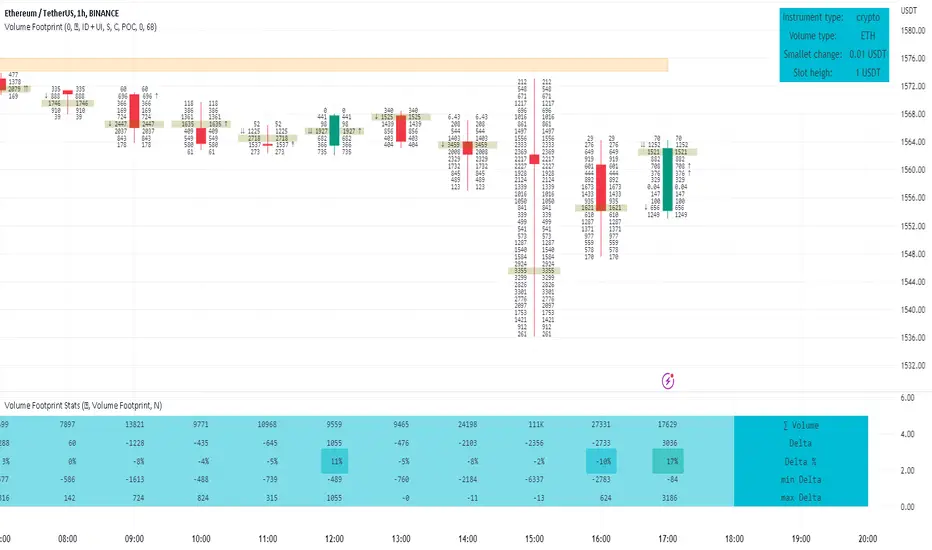
Footprint ClassicThe Volume Footprint chart is analyzing volume data contained within candles and split it into two components - Up and Down volume. This analysis is similar to how Volume Profile evaluates volume data from a portion of the chart.
This script can be used by any user. You do not need to have PRO or PREMIUM account to use it.
As a user, you have the flexibility to select the desired level of data precision for the Volume Footprint analysis. We highly recommend using the highest precision possible, as it provides the most accurate results. However, it's important to keep in mind that Trading View has several limitations and not all levels of precision are available on all intervals. The higher the precision, the shorter the history of available data.
If, after adding the script or changing the precision, you encounter an error message stating "'The study references too many candles in history'", it may be necessary to reduce the precision level in the script settings to resolve the issue.
This script is a part of the "Volume Footprint" toolkit, which includes:
I. Footprint chart visualization scripts in two variants:
⠀⠀Volume Footprint - Presenting volume data on both sides of the candle.
⠀⠀Volume Footprint Classic - Presenting volume data on the right side of the candle.
II. Supporting tools:
⠀⠀Volume Footprint Statistics - Script presents, in tabular form, basic statistics calculated from candle volume data, such as Delta, min Delta, max Delta and more. It can support both Volume Footprint and Volume Footprint Classic.
⠀⠀Volume Footprint Candles - Tool drawing candles adapted for footprint chart scripts.
III. Tools dedicated to more detailed analysis:
⠀⠀Volume Delta - A candle chart illustrating changes in delta values.
⠀⠀Volume Cumulative Delta - A candle chart ilustrating changes in cumulative delta values.
⠀⠀Volume Delta In Candle - A line chart showing changes in delta values over a period equal to the chart interval.
⠀⠀Volume Cumulative Delta in Interval - A line chart showing changes in cumulative delta over a period equal to the chart interval.
Script with limited access, contact author to get authorization
User Interface:
The script groups Up and Down volume into slots based on price. The height of the slots is controlled by the "Slot height" parameter in the settings. Each slot has the following configurable features:
Text - A label that displays the value. You can choose from:
⠀- - Hidden
⠀V - Slot Volume (UP + Down)
⠀V% - Slot volume as percentage of Candle volume
⠀UD - Up and Down volume
⠀UDI - Up and Down volume + Imbalance symbols.
⠀Δ - Delta (Up - Down Volume)
⠀Δ% - Delta as percent of slot volume (from -100% to 100%)
Border - Highlight slots with border color. You can chose from:
⠀- - Hidden
⠀C - Constant color
⠀POC - Slot with biggest volume
⠀V - Slot volume compared to other slots in that candle
⠀VA - Value area, highlights slots forming the value area
⠀Δ - Delta is the slot.
Background - Highlight slots with background color. You can pick one of:
⠀- - Hidden
⠀C - Constant color
⠀POC - Slot with biggest volume
⠀V - Slot volume compared to other slots in that candle
⠀VA - Value area, highlights slots forming the value area
⠀Δ - Delta is the slot.
Imbalances symbols:
Before the Down Volume, the following imbalance symbols may appear:
⠀↓ - 3 times
⠀↡ - 5 times
⠀⇊ - 10 times
After the Up Volume the following imbalance symbols may appear:
⠀↑ - 3 time
⠀↟ - 5 times
⠀⇈ - 10 times
Above the candle, the following basic statistics can be shown:
"V:" - Row with volume statistics:
⠀∑ - Total volume ,
⠀Δ - Difference between Up and Down Volume .
⠀min Δ - The smallest difference between Up and Down Volume in that candle
⠀max Δ - the biggest difference between Up and Down Volume in that candle
Script settings:
Slot height = 10^ - Price slot height on the chart, recorded as a power of 10, which means:
⠀ 0 - 1$
⠀ 1 - 10$
⠀ 2 - 100$
⠀ 3 - 1000$
⠀-1 - 0.1$
⠀-2 - 0.01$
⠀-3 - 0.001$
Data precision - One of 6 standard levels of data precision: ▉▇▆▅▃▁, where ▉ means the highest precision and ▁ the lowest available precision and two special values "W" and "M" dedicated for biggest intervals. The highest precision should be available for 15-minute chart, but for a 1D chart, it may hit TradingView limitations and the script will not be launched by the platform with error: "'The study references too many candles in history'". The general recommendation is to use the highest available precision for a given instrument and interval.
Precise warnings - An option to show warnings about missing volume in candle footprint (warning connected with one of TradingView limitations).
Text - Picking what king of info is on label:
⠀- - Hidden
⠀V - Total slot Volume
⠀V% - Slot volume as % of Candle volume
⠀UD - Up and Down volume
⠀UDI - Up and Down volume + Imbalance symbols.
⠀Δ - Delta
⠀Δ% - Delta as percent of slot volume
Centered - If checked volume labels are stick to candle (centered), if not they are alligned to right.
Border, Background:
⠀- - Hidden
⠀C - Color1
⠀POC - Slot with biggest volume
⠀V - Slot volume compared to other slots in that candle
⠀VA - Value area, highlights the slots forming the value area
⠀Δ - Delta is the slot, color1 is used when volume Up is at least 10% bigger, color2 is used when Volume Down is at least 10% bigger
Filter - Filtering option than allow hinding labels with small values:
⠀0 - filter turned off.
⠀1-5 - filtering with transparency
⠀6-10 - Filtering with hiding values
Show zeros - Option to show zeros or leave empty spaces
Draw candles - Option to draw candles that fit the volume labels, and 2 fields to choose the color of up and down candles. It is recommended to hide chart candles and use candles adapted to the footprint chart. TradingView has a bug and candles are drawn under the slots. If you choose a non-transparent background or border, they may be invisible. If possible (free accounts have a limit of 3 scripts), it is recommended to use Volume Footprint Candles script to draw thin candles over the slots.
Show stats - Showing stats over the candle: ∑, Δ, min Δ, max Δ. It's recommended to use 'Volume Footprint Statistics' script instead
Font size - Used to draw stats over the chart: T(iny), S(mall), N(ormal), L(arge)
Instrument and Volume status - A dialog showing basic chart information: Instrument type, Volume type, Smallest change, slot height.
Value area - Value area is the smallest group set of neighboring slots that have at least n(param) % of candle volume.
⠀ Value Area Minimal Volume (%) - Value area size as % of candle volume
⠀ Track - Option to track value areas, potencial support-resistance zones.
⠀ Only active - Option to hide areas that were crossed by the price.
⠀ Show Values - Opiton to show volume value over tracked value areas.
Alerts:
⠀ One alert per Bar - Emits no more than one alert per bar.
⠀ Add value area to tracking - Emits an alert about a new VA beeing added to the tracking list.
⠀ Remove value area from tracking - Emits an alert when a VA is removed from the tracking list.
Troubleshooting:
In case of any problems, please send error details to the author of the script.
Known issues:
"The study references too many candles in history" - If you encounter this issue, try changing "Data precision" setting to a lower value.

Volume FootprintThe Volume Footprint chart is analyzing volume data from inside the candle and split them into Up and Down Volume in the same way as Volume Profile analyzes the volume data from a fragment of the chart.
The visualization is little different:
Down Volume (sells) are shown on the left side of a candle.
Up Volume (Buys) are shown on the right side of a candle.
User can pick data precision used by Volume Footprint. We recomend to use the highest possible precision.
Unfortunatelly Trading View has many limitations.
If after adding script nothing is visible with error: "'The study references too many candles in history'" you need to use lower precision - It can be changed in script settings.
This script is a part of a toolkit called "Volume Footprint", containing few tools:
Volume Footprint - Scripts drawing Volume Footprint chart.
Volume Footprint Statistics - Script showing table with basic statistics about Up and Down volume inside the candles.
Volume Delta In Candle - Chart showing history of delta (difference between Up and Down volume) changes inside the current candle.
Volume Cumulative Delta - Chart showing history of cumulative delta (sum of difference between Up and Down volume in trading period equal to chart interval).
This script can be used by any user. You do not need to have PRO or PREMIUM account to use it.
Script with limited access, contact author to get authorization
User Interface:
Script is grouping Up and Down Volume into slots based on price. Slots height is controled by "Slot height" param in settings.
On left side of a candle Down Volume is shown and on right side Up Volume is shown.
Before Down Volume may appear imbalance symbols:
⠀↓ - 3 times
⠀↡ - 5 times
⠀⇊ - 10 times
After Up Volume may appear imbalance symbols:
⠀↑ - 3 time
⠀↟ - 5 times
⠀⇈ - 10 times
Above the candle we can show some basic statistics of that candle:
"V:" - Row with volume statistics:
⠀∑ - Total volume,
⠀Δ - Difference between Up and Down Volume.
⠀min Δ - Smallest difference between Up and Down Volume in that candle
⠀max Δ - Biggest difference between Up and Down Volume in that candle
Script settings:
Slot height = 10^ - Price slot height on the chart:
⠀ 0 - 1$
⠀ 1 - 10$
⠀ 2 - 100$
⠀ 3 - 1000$
⠀-1 - 0.1$
⠀-2 - 0.01$
⠀-3 - 0.001$
Data precision - One of 6 levels of data precision: ▉▇▆▅▃▁, where ▉ means the highest precision and ▁ the lowest available precision. On 15 minute chart highest precision should be available, but on 1D it will probably hit TradingView limitations and script will not be even launched by the platform with error: "'The study references too many candles in history'". The general recommendation is to use the highest available precision for a given instrument and interval.
Precise warnings - Option to show precise warnings about missing volume in candle footprint (warning connected with one of TradingView limitations).
Draw candles - Option of drawing candles fiting to volume labels and 2 fields for picking colors of up and down candles. The general recommendation is to hide chart candles and turn on this option.
Show stats - Showing stats over the candle: ∑, Δ, min Δ, max Δ. You can use 'Volume Footprint Statistics' script instead
Font size - Used to draw all the data over the chart: T(iny), S(mall), N(ormal), L(arge)
Centered - If checked volume labels are stick to candle (centered).
Color values - Option to draw labels with use of Up or Down color, depending which value (Volume Up or Volume Down) is bigger in the price slot.
Filter - Filtering option than allow hinding labels with small values:
⠀0 - filter turned off.
⠀1-5 - filtering with transparency
⠀6-10 - Filtering with hiding values.
Show zeros - It can show zeros or leave empty places
Highlight biggest slot - Option to highlight price slot with biggest volume in the candle.
Imbalances - Showing imbalance symbols before Down or after Up Volume
Only over average - Showing imbalances symbols only for volume not smaller than the average value.
Value area - Option to identify group of slots with biggest volume in each candle. A group is a smallest set of neighboring slots that have at least n(param) % of candle volume .
⠀ Value Area Minimal Volume (%) - Value area size as % of candle volume .
⠀ Color - Color of the Value area.
⠀ Show borders - Showing border lines of value areas over the candle.
⠀ Track - Option to track value areas. Potencial Support-Resistance zones.
⠀ Only active - Hide areas that were crossed by the price.
Show Values - Show volume value over tracked value areas.
Troubleshooting:
In case of any problems, send error details to the author of the script.
Known issues:
"The study references too many candles in history" - Change "Data precision" settings to some lower value.
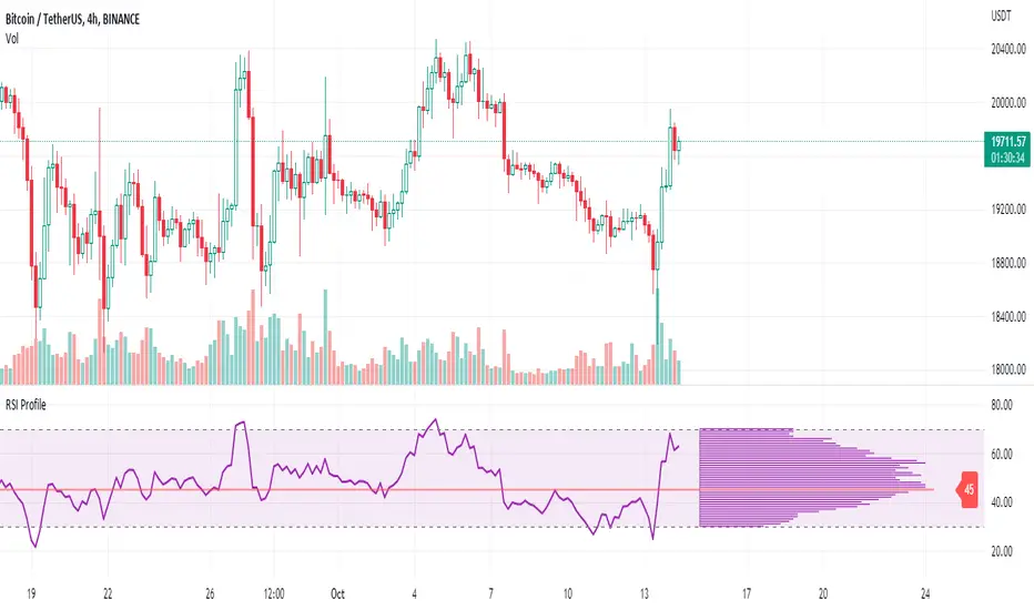
RSI ProfileThis indicator shows the RSI profile from historical RSI Value and High / Low RSI Pivots.
It is inspired by the Volume Profile which is a common charting study that indicates activity at specified levels. It plots a histogram on the chart meant to identify dominant/significant levels.
This script is profiling RSI levels into a histogram, which can identify the crucial RSI values in the chart. Along with the pivot options that can help identify the dominant pivot points where RSI values had been rebounding historically.
How to use:
There are three profile types available in the settings. When selecting RSI Values, the indicator will count RSI values from history, and plot the count in a histogram at the end of the chart. If you select RSI Pivots High or RSI Pivots Low, the indicator will count only the RSI Pivot Highs and Lows and plot the count in a histogram. Users can select the Pivot Left/Right length from the settings.
Users can extend the POC line to the left, to study how the values had been reacting to POC
Please note: Since the RSi values range from 0 to 100, the indicator is rounding off the values to absolute numbers. This can cause a situation where multiple POC are identified, to find the unique POC, you can increase the width of the histogram.
The Max/Min RSI settings are for visual purposes only, it can help users shrink down the histogram's top and bottom visibility
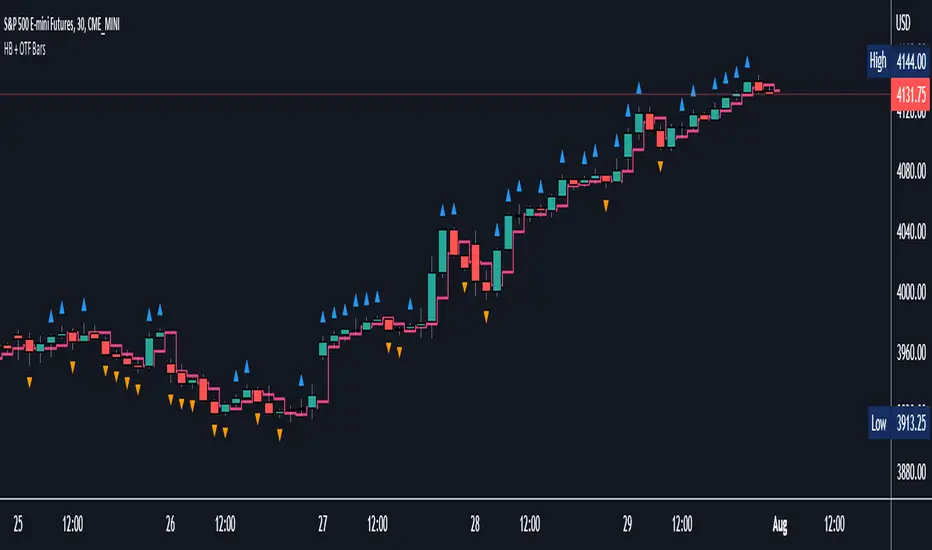
Halfback + One-Time-Framing BarsThis indicator is designed to be used with Market Profile / Volume Profile trading techniques on a 30min chart.
The halfback of a candle is the mid point between the high and the low of the candle. A halfback trade can be taken once price retraces into this point as support/resistance using the prevailing trend as your trade direction.
One-Time-Framing is a fancy term for trending in one direction. One-Time-Framing happens when a candle breaks the previous candle's high without testing the low or when a candle breaks the low of the previous candle without testing the high. This indicates that the trend is one directional and opposing pressure is very weak. Taking trades in the opposing direction of multiple OTF bars is typically a bad trade setup.
Halfback and OTF setups are typically used on a 30min timeframe combined with Market or Volume Profile, but you can experiment with these setups on any timeframe if you wish.
I hope you all enjoy this indicator, comment below if you have any questions.
Koalafied Volume Extension BubblesCircles based on extensions from volume Z-Score. Large volume candles can often signal exhaustion or show market strength in reversals or breakouts. Circles can be offset back to the start of the day/profile or left at the time where they occur.
Colours denoting deviations from the mean are
+2 std dev - Green
+1 std dev - Blue
-1 std dev - Red
-2 std dev - Purple
Concept is primarily as a pseudo volume profile delta tool. Obviously it's a very basic heuristic so would recommend further reading and use of actually footprint data to base trading decisions on.

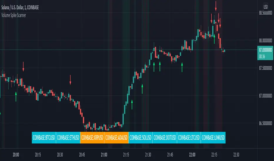
Volume Spikes & Growing Volume Signals With Alerts & ScannerVOLUME SPIKES & GROWING VOLUME SIGNALS WITH ALERTS & SCANNER
This indicator shows arrows when there is a volume spike. It also paints the background when volume is growing. There is also a volume scanner for 8 tickers that will change color in real time when your other favorite tickers see volume growth and spikes.
You can customize the length of DMI, the number of bars to calculate the current volume average from, the number of bars back to get the overall volume average from, the multiple that needs to be hit to give a signal, the position of the scanner table and which tickers are used in the scanner. There are detailed directions as tooltips in the indicator settings you can read to understand exactly what each input does.
All features are customizable as well as which tickers the screener uses.
***HOW TO USE***
Watch for volume to pick up before placing trades as this will help you stay out of the markets when price is choppy. Volume usually brings volatility so watch for the volume signals to show up on the chart. Typically when price has made a big move one direction or is consolidating and you see the volume indicator start giving signals, the market is ready to reverse or continue its current trend but move faster in that direction.
Volume Spikes
When there is a volume spike that is larger than the average of volume over the last 100+ bars(depending on your settings) multiplied by the volume amount multiplier(in your settings) then an arrow will show up on the chart. This arrow will be green if DMI is bullish and red if DMI is bearish.
Volume Growth
A Background color will appear when the average volume over the last 5 bars(depending on your settings) is higher than the average volume over the last 100+ bars(depending on your settings) and is greater than your multiple. It will also paint the background when the volume moving average has increased over the last 3 bars consecutively. The background colors will be red or green depending on buy & sell pressure(DMI). If the background color appears, then you know volume is growing and volatility is near.
Volume Scanner
The scanner can be customized to have all of your favorite tickers by changing the tickers used in the indicator settings at the bottom. When no volume growth or spikes are detected, the ticker will show as light blue. When volume spikes or growth is detected, the ticker will turn orange to notify you.
Alerts
You can set up alerts as well when there is volume growth, bullish volume spikes and bearish volume spikes on any chart or timeframe.
Indicator Settings
Settings will need to be adjusted across different tickers as some have large swings in volume and some stay pretty even, so make sure to set up different chart layouts with settings that work for each ticker and save them individually so you don’t have to reset these values every time you switch charts.
***MARKETS***
This indicator can be used as a signal on all markets, including stocks, crypto, futures and forex as long as Tradingview has volume and DMI data for that ticker.
***TIMEFRAMES***
This volume spike indicator can be used on all timeframes as long as there is enough data for Tradingview to use for calculations.
***TIPS***
Try using numerous indicators of ours on your chart so you can instantly see the bullish or bearish trend of multiple indicators in real time without having to analyze the data. Some of our favorites are our Auto Fibonacci, Volume Profile, Momentum, Auto Support And Resistance and Money Flow Index in combination with this Volume Growth indicator. They all have real time Bullish and Bearish labels as well so you can immediately understand each indicator's trend.
Swing Assassin's Consolidated ScriptI put this script together to essentially consolidate a number of scripts that I use on a daily basis into one script. This is an ongoing improvement effort, so there may be some garbage in here right now so keep that in mind if you intend to use this to help in your trading.
There are 5 moving averages (Hull). I use the Fast, Mid and Slow to find entries after I us the Medium Slow and Super Slow to identify a trend. Otherwise, I have those three turned off.
This script also uses Bollinger Bands which I literally cannot trade without.
The script also has anchored VWAP , automated support/resistance lines, and a homebrewed Volume Profile that is a copy from Ildar Akhmetgaleev's indicator "Poor Man's Volume Profile" used under Mozilla Public License Version 2.0.

Market Profile with TPOThis is is Market Profile with TPO (the letters) on the current session. Due to pinescript limitations, we are limited to 500 TPOs, since this script uses 1 label per TPO. It is NOT volume profile, this is Time Profile (Time spent at a price).

Multi Time Frame Effective Volume ProfileWHAT DOES THIS INDICATOR DO?
It is a well-known fact that volume often precedes price. As such, if you can spot an increased volume early on, you can take a position before the majority joins the trend. The purpose of this indicator is to show the tactical moves of the insiders and the big players before they become obvious to everyone. Similarly, you should more easily be able to identify trend exhaustion and look to close your position.
This volume indicator is largely inspired by Pascal Willain's concept of Effective Volume described in his book "Value in Time" , which is an improvement over Larry Williams' accumulation/distribution formula. The more robust formula takes into account two very important factors:
1) the gaps that are an inevitable part of almost all securities;
2) the closing price in relation to the spread, which indicates the bull/bear strength;
I have slightly modified Pascal Willain's formula for Effective Volume and introduced a few additional features, which I believe make the indicator easier to use and understand.
HOW DOES THE INDICATOR WORK?
1. Volume Bar Deconstruction
The first significant part of this indicator is that it deconstructs the volume bar of your current trading session into one-minute volume bars, separates the significant volume, and then reconstructs the bar again. As a result, you get a new bar, in which only the significant volume is counted. Not only this, but you also get a more comprehensive view of the relationship between buying and selling that occurred on the smaller time frame.
In the screenshot below you can see that although the bears were stronger, the bulls met them with almost identical force, which resulted in absorbing the supply in 1 and then in 2 the demand drove the price up. In a traditional volume bar chart (which is also plotted), you only see the total traded volume in either red or green depending on the closing of the bar. As you would probably agree, this does not reveal the whole story.
Accumulation/distribution by large players and funds is done with great precision, which is hard to catch intraday and nearly impossible on a daily time frame. However, large orders are hard to conceal on the 1-min chart since any unusual volume sticks out like a sore thumb. The whole idea here is for you to get a comprehensive view of what's going on in the small time frame, reveal any hard to spot transactions, and then make an informed decision on your trading time frame.
To ease your analysis even further, the indicator shows you minor volume as a percent of the major volume . Since your current time frame volume bar is a sum of all buying and selling volume from a smaller time frame, you get to see a more complete picture of the buying and selling that occurred. For example, you have a total volume of 150 BTC in a single 1h volume bar, out of which 100 BTC is in selling volume and 50 BTC is in buying volume. What you will see as parameters are this: 50 (buying volume), 100 (selling volume), 50 (minor volume as a percent of the big volume, since 50/100 = 0.5 = 50%). The higher the percentage, the more even the powers between buying and selling are.
2. Volume Trend
Building upon the first feature of the indicator, you can also choose a cumulative volume trend line. It is constructed by evaluating the type of the significant volume - adding it up if the bar closes positive (green) and subtracting it if the bar closes negative (red). The evaluation is once again done on a 1-min time frame by default, but you can change that along with the count lookback period in settings.
3. Bull / Bear Equilibrium
Based upon the volume bars, Bull/Bear Equilibrium shows you the difference between buying and selling pressure under the form of a smoothed histogram. It is particularly useful not only for spotting trends early in the beginning, but also when those trends start reaching a point of exhaustion. You can then move your Stop Loss accordingly, close part of your position to preserve profits, or even look for a good entry position in the opposite direction.
HOW MUCH DOES THE INDICATOR COST ?
As much as I would like to offer it for free (as some of my other ones), a great deal of work, trading logic, and testing have gone into creating this indicator. More than a few hundred iterations and a few dozen branches were required to reach the end result which is a precise combination of usefulness, simplicity, and practicality. Furthermore, this indicator will continue to be updated and user-requested features that improve its performance will be added.
Disclaimer: The purpose of all indicators is to indicate potential setups, which may lead to profitable results. No indicator is perfect and certainly, no indicator has a 100% success rate. They are subject to flaws, wrongful interpretation, bugs, etc. This indicator makes no exception. It must be used with a sound money management plan that puts the main emphasis on protecting your capital. Please, do not rely solely on any single indicator to take trading decisions instead of you. Indicators are storytellers, not fortune tellers . They help you see the bigger picture, not the future.
To find out more about how to gain access to this indicator, please use the provided information below or just message me. Thank you for your time.

Poor man's volume clustersVolume clusters created from candlestick volumes.
See also "Poor man's volume profile" .
The code is generated using a template. To change the settings, you may need to regenerate the code. The code has a link to the repository with the template.

Cumulative Overlapping Volume BarsThis is cheap replacement for volume profile.
Red bars is where accumulated high volume in small range.
if new bar moves out of range all accumulated volume will be lost and color will change.
Delta Volume Columns [LucF]Displays delta volume columns using intrabar volume information. Each volume column is divided into three sections: buying, selling and neutral volume. Volume for each section is determined from the volume and price movement of each intrabar at a user-selected lower resolution.
Features include:
- Choice of color themes for either dark or light chart backgrounds
- Delta volume columns
- Volume Balance displayed as the difference between the MAs of buying and selling volume
- Display of divergences between a bar’s volume balance and the bar’s price movement (example: buying volume > selling volume but close < open). Divergences can be shown in 2 different color schemes (including green/red showing a tentative direction), on volume columns and/or on chart bars
- Display of bar by bar volume balance with highlighting of above average volume
- Display of the usual total volume MA
- Choice of the lower resolution used to retrieve intrabar information
- Alerts configurable on any combination of the markers, with control over long/short direction
- Choice of 3 different markers:
1. Double bumps: two consecutive bars where buying or selling volume is in the same direction and where volume > volume MA
2. Divergence confirmations: direction of the price bar following a price/volume balance divergence
3. Volume balance shifts: zero level crossings of the volume balance MA delta
The chart shows the two main modes of display:
- Top pane : shows the stacked volume columns with divergences in orange and the flattened volume balance MAs delta at the bottom of the volume columns. This volume balance is the same shown in the bottom pane. The top pane also shows the instant volume balance strip above the volume columns. The strip’s colors show which of the buying or selling volume was greater, and colors are brighter if the total volume was above the total volume MA.
- Bottom pane : shows the volume balance MAs delta with markers 1 and 2. Given that this graphic has no price momentum component, I find quite eerie how it often looks like a momentum-based signal.
The default 5 minute intrabar resolution is used in combination with the weekly chart, which is excessive.
This script uses a special characteristic of the security() function’s behavior when it is sent to a resolution lower than the chart’s resolution. Details are given in the script’s comments. This method has the advantage of working under more circumstances than some of the other loop-based methods, but it also has its limits.
IMPORTANT
This is what you need to know:
- The method used does not work on the realtime bar—only on historical bars. Consequently, the volume column shown on the realtime bar is a normal volume column plotted in green or red, following price movement. The column will only show delta volume information after it closes and becomes a historical bar.
- The indicator only works on some chart resolutions: 5, 10, 15 and 30 minutes, 1, 2, 4, 6, and 12 hours, 1 day, 1 week and 1 month. The script’s code can be modified to run on other resolutions, but chart resolutions must be divisible by the lower resolution used for intrabars.
- Intrabar resolutions can be selected from 1, 5, 15, 30, 45 minutes, 1, 2, 3, 4 hours, 1 day, 1 week and 1 month. The intrabar resolution must of course be smaller than the chart’s resolution.
- Contrary to my other indicators where alerts must be configured to trigger “Once Per Bar Close” in order to avoid false triggers (or repainting), all this indicator’s alerts are designed to trigger using previous bar information since the indicator’s calculations in the realtime bar are not exact. Markers are not plotted with a negative offset; they appear at the beginning of the realtime bar following confirmation of the marker’s condition on the previous bar. Alerts for this indicator should thus be configured to trigger “Once Per Bar” so they trigger at the beginning of the realtime bar. Note that the penalty is not that great, as it is simply the instant between the close of the previous realtime bar and the opening of the next. The advantage of using this technique is that the indicator does not repaint; a marker that appears at the beginning of the realtime bar will never disappear.
- The script only plots information that is reliable in the realtime bar, i.e., total volume and markers. All other plots are set to n/a to prevent misleading traders.
- When the difference between the chart’s resolution and the lower resolution is too important, volume columns will not calculate for all bars in the dataset.
On Delta Volume
Buying or selling volume are misnomers, as every unit of volume transacted is both bought and sold by 2 different traders. There is no such thing as “buy only” or “sell only” volume, but trader lingo is riddled with original fabulations.
Without access to order book information, traders work with the assumption that when price moves up during a bar, there was more buying pressure than selling pressure. The built-in volume indicator available on TradingView uses this logic to color the volume columns green or red. While this script’s numbers are more precise because it analyses a number of intrabars to calculate its information, it uses the exact same imperfect logic to calculate its buying/selling/neutral sections.
Until Pine scripts can have access to how much volume was transacted at the bid/ask prices, our so-called buying/selling volume information will always be a mere proxy.
Divergences
You may wonder how there can be divergences between buying/selling volume information and price movement. This will sometimes be due to the methodology’s shortcomings we have just discussed, but divergences may also occur in instances where because of order book structure, it takes less volume to increase the price of an asset than it takes to decrease it.
As usual, divergences are points of interest because they reveal imbalances, which may or may not become turning points. I do not share the overwhelming enthusiasm traders have for divergences. To your pattern-hungry brain, the orange bars this indicator shows on chart will—as divergences on other indicators do–appear to often indicate turnarounds. My opinion is that reality is generally quite sobering, as many who have tried building automated rules based on divergences will tell you. I do not have hard numbers on the lack of performance of divergences—only many failed attempts to make them perform, which a few experienced strategy modelers I know share with me. Please don’t try to read too much into them. While they look great on past data, I find they are often difficult to use in realtime to make bets with good odds.
Thanks to:
- A guy called Kuan who commented on a Backtest Rookies presentation of an intrabar delta volume indicator using a for loop. The heart of “my” indicator is code borrowed from Kuan; I just built a hopefully useful wrapper around it.
- @theheirophant, my partner in the exploration of the sometimes weird abysses of security() ’s behavior at lower resolutions.

MTF Key Levels Pro [Confluence & Flow]MTF Key Levels Pro is an all-in-one market structure and context toolkit designed to reduce chart noise and surface the price levels that matter most. It combines multi-timeframe trend alignment, institutional-style reference levels (VWAP anchors, pivots, volume POC, prior day levels), and confluence detection so you can quickly identify where price is likely to react—and whether the broader flow supports continuation or reversal.
This script is intentionally modular: you can enable only what you trade (scalping, day trading, swing, position) while keeping the chart readable via selective plotting and a compact MTF dashboard.
What It Does
1) Key Levels Engine (Core Map)
The indicator plots a “key-level stack” from multiple methodologies so you are not relying on a single lens:
Volume Profile POC (Point of Control) over a configurable lookback (highest traded activity zone).
Daily Pivot Levels calculated from prior day H/L/C (PP, R1, S1 and extended levels in the logic).
Fibonacci Retracements from recent swing range (38.2 / 50 / 61.8).
Moving Averages (three configurable MAs for trend structure).
Previous Day High/Low (PDH/PDL) for intraday reference points.
ATH/ATL tracking (optional) for macro context.
2) Anchored VWAP Suite (Flow Anchors)
A multi-anchor VWAP system that resets and recalculates at the start of each period:
Hourly VWAP (scalping / micro-structure)
Daily VWAP (day trading standard reference)
Weekly VWAP (swing context)
Monthly VWAP (position context)
3) Multi-Timeframe Alignment Dashboard (Trend Consensus)
The dashboard pulls 5 configurable timeframes (defaults: 5m, 30m, 1h, 4h, D) and displays:
Price snapshot per timeframe
Trend direction (simple momentum/trend comparison vs lookback)
Volume
% change
Alignment status (BULL ALIGNED / BEAR ALIGNED / MIXED), including bars since alignment began
Use this to avoid trading against higher timeframe pressure and to time entries when multiple timeframes agree.
4) Order-Flow Lite (Volume & Delta)
A practical “flow confirmation” layer using candle-based volume classification:
Buy vs sell volume approximation (close vs open)
Delta strength label (Strong Buy / Strong Sell / Neutral)
Volume surge detection vs SMA(volume) with a configurable multiplier
Optional background shading on surge events
5) Confluence Zones (Signal Compression)
Confluence zones automatically form when multiple independent levels cluster together within a configurable tolerance:
You choose tolerance % and minimum levels required (e.g., 3+).
Zones are plotted as highlighted regions and listed in the dashboard with proximity markers (AT / NEAR).
This is the “decision layer”: the script doesn’t just draw levels—it tells you where multiple reasons to react overlap.
How to Use It (Practical Outline)
Typical Workflow
Check dashboard alignment: trade with alignment for continuation setups; treat MIXED as caution/mean-reversion regime.
Identify nearest confluence zones: prioritize trades at/near zones versus isolated single levels.
Use VWAP anchor + PDH/PDL + Pivot as the intraday framework, then confirm with volume surge/delta bias.
Manage risk around zones: zones are natural areas for rejection, breakout, or retest logic.
Recommended Configurations (Quick Start)
Scalping (1m–5m chart): Hourly VWAP + Daily VWAP + Daily Pivots + Confluence
Day Trading (5m–1h): Daily VWAP + Pivots + PDH/PDL + Confluence + Alignment dashboard
Swing (1h–4h): Weekly VWAP + MA50/MA200 + Confluence + Alignment
Position (D/W): Monthly VWAP + MA200 + ATH/ATL + Confluence
Alerts Included
Confluence Touch: triggers when price is within proximity of a confluence zone.
Trend Change: triggers when the alignment state changes (e.g., MIXED → BULL ALIGNED).
Volume Spike: triggers on surge events versus the configured baseline.
Notes / Intended Use
This indicator is built for context and decision support (key levels + trend consensus + flow cues). It is not a standalone “buy/sell system” by design; instead, it provides a structured map for entries, invalidation, and target planning around areas of highest market agreement.
If you want, I can also produce a TradingView-ready “Description + Feature bullets + How to trade + Settings guide + Alert guide” in the exact formatting style commonly used on public TradingView scripts (including a short disclaimer and a clean feature list).

NY Session Vol Entries (RB Trading)NY Session Vol Entries (RB Trading)
NY Session Vol Entries is an intraday analysis script designed to evaluate price behavior during U.S. market hours on the one hour chart. It focuses on the interaction between relative volume expansion, adaptive volatility structure, and directional momentum alignment to help users interpret active market conditions.
The script is intended specifically for liquid U.S. equities during the New York session and is not designed for use outside this context.
Intended Usage and Scope
• Timeframe: 1 hour only
• Market hours: New York session
• Asset class: U.S. equities with consistent volume
• Style: Intraday structure and momentum evaluation
• Alerts: Available for all signal types
Core Framework
The script evaluates market behavior through three interdependent components that must align before a setup is displayed:
Relative volume behavior
Volatility expansion and contraction
Directional momentum context
This structure helps filter low-participation periods and reduce noise.
Relative Volume Analysis
The script compares current volume to a rolling 14-period average to identify periods where participation meaningfully deviates from typical conditions.
Elevated volume often occurs during session opens or active repricing phases. When volume remains muted, the script suppresses signals to avoid low-quality environments.
Adaptive Volatility Structure
Volatility bands are calculated using an 8-period true range measurement. These bands adjust dynamically based on recent volatility rather than remaining static.
During elevated participation, the bands compress to reflect tighter price acceptance. As volatility expands, the bands trail price to help visualize directional structure.
Directional Momentum Context
Directional context is determined using a dual moving average relationship.
• When short-term momentum is above longer-term momentum, the script allows only bullish evaluations
• When short-term momentum is below longer-term momentum, the script allows only bearish evaluations
This alignment reduces counter-directional signals and helps maintain structural consistency. The filter can be disabled if users wish to study range behavior.
Signal Classification
The script displays two types of informational labels:
Volume-Aligned Signals
These appear only when directional momentum and relative volume expansion align at candle close.
Momentum Rotation Signals
These indicate directional shifts regardless of volume and are intended to provide context rather than standalone triggers.
All signals are confirmed only after the candle closes. No intrabar logic is used.
Stop and Target Reference Plotting
When conditions align, the script plots visual reference levels:
• A stop reference positioned beyond the momentum structure
• A projected target reference calculated using a fixed 2R multiple relative to the stop distance
These levels are provided for consistency and planning. They are not forecasts or guarantees.
Session and Timing Considerations
The script is designed specifically for New York market hours. Liquidity and participation outside this window often distort volume and volatility behavior.
Earnings sessions should be treated with caution, as event-driven price action can override normal structural behavior.
Opening Range Consideration
The first one hour candle of the New York session can display elevated volatility due to initial repricing. Allowing additional candles to form may provide clearer structural information before evaluating signals.
Why One Hour and New York Session
The one hour timeframe balances structure and responsiveness while reducing lower-timeframe noise. New York trading hours provide the most reliable volume profile for U.S. equities, making relative volume analysis more meaningful.
Settings Overview
• Volatility period: 8
• Volatility multiplier: 3.0
• Volume average period: 14
• Momentum averages: 8 and 21
• Trend filter: Enabled by default
• Alerts available for all signal types
Chart Usage Guidelines
• Use the script on a clean chart
• Avoid stacking additional momentum or volume indicators
• Drawings should only be used when they help interpret structure
Important Notes
This script analyzes historical price and volume behavior. It does not predict future price movement or ensure outcomes. Users should test the tool, understand its logic, and apply independent risk management.

CK: Locked Session H/L + Volume Profile (1m Fixed)The session roadmap every futures trader needs — without the clutter.
This tool automatically locks the previous session’s structure and gives you the five most important institutional levels:
✅ Locked Session High
✅ Locked Session Low
✅ Session POC (Point of Control)
✅ VAH – Value Area High
✅ VAL – Value Area Low
Everything is calculated using 1-minute data only, so your levels are accurate, consistent, and never repaint.
💡 What It Does
Tracks the entire session from the RTH close to the next RTH close.
Builds a volume-by-price profile for that session.
Automatically freezes the session’s:
Highest price
Lowest price
Most-traded price (POC)
70% value area (VAH/VAL)
Plots all levels as clean horizontal lines for today’s trading.
🚀 Why Traders Use This
These 5 levels control most algorithmic and institutional activity.
This indicator shows you exactly where price reacted yesterday, so you can:
Catch retests and bounces with confidence
Avoid trading in the middle of nowhere
Anticipate reversals, breakouts, and liquidity grabs
Build a consistent plan around the same fixed levels every day

XAUMO MegaBar VSA by Mohamed Mahmoud XAUMO MegaBar VSA — Smart Money Breakout & Reversal Engine for XAUUSD
(Educational Use Only)
1) WHAT THIS INDICATOR DOES
XAUMO MegaBar VSA is an institutional-style smart money engine for XAUUSD designed to show you what professional money is doing, not just where price is moving.
It combines:
- MegaBar detection on 1H and 15m
- VSA (Volume Spread Analysis) events
- VPOC / WVPOC and volume clusters
- Liquidity sweeps, CHoCH, order blocks, FVGs
- Full Fibonacci leg mapping (retracements + extensions)
- Pre-built execution ladders (Entry, SL, TP1–TP4, Reverse Fib trades)
All in one dashboard with:
- Color-coded candles
- Clean, ATR-offset labels
- Optional tables and debug panels
So traders can quickly decide:
“Is this move driven by smart money, or is it just noise?”
2) CORE MODULES & FEATURES
A) SESSION + ACCUMULATION / DISTRIBUTION CONTEXT
- Session filter: London, New York, Overlap, or custom.
- Accumulation / distribution zones shaded on chart with adjustable colors/opacity.
- Quick legend so you always know if the market is in “smart money accumulation” or “distribution”.
HOW TRADERS USE IT:
Focus only on your trading session and instantly see if volume is building (accumulation), unloading (distribution), or flat. This helps you avoid trading in dead liquidity.
--------------------------------------------------
B) MEGABAR ENGINE + FIB MAP
- Automatically detects “MegaBars” (institutional candles) on 15m and 1H.
- Uses body size, range, and volume to pick only meaningful bars.
- Builds a full Fibonacci map from each active MegaBar:
• Retracements: 0, 13, 23.6, 38.2, 50, 61.8, 78.6, 86.2, 100, and -33.
• Extensions: 125% up to 600%+ (configurable ladder).
- Per-level style controls:
• Color, width, line style (solid/dotted/dashed).
• Optional price labels with ATR-based offsets.
- Main Fib legend that explains shallow / normal / deep reload zones.
HOW TRADERS USE IT:
You stop guessing where to buy or sell. You trade around the institutional leg:
- Buy dips into defined reload zones after bullish MegaBars.
- Sell rallies into extension zones after bearish MegaBars.
- Use clean, pre-mapped structure for both scalps and swings.
--------------------------------------------------
C) VSA ENGINE + CANDLE LABELING
- Detects a full set of VSA events such as:
• No Demand / No Supply
• Stopping Volume
• Absorption
• Springs / Upthrusts
• Buying Climax / Selling Climax
• Bullish / Bearish EVR
• Tests and confirmed VSA signals at S/R
- Enhances with:
• Body vs total range analysis
• Wick dominance for exhaustion vs aggression
• Momentum and volume confirmation filters
HOW TRADERS USE IT:
Each label becomes a “comment” from smart money on the chart:
- “No Demand” near resistance + weak RVOL = skip long entries.
- “Stopping Volume” + spring at Fib reload zone + VPOC cluster = potential high-quality long.
- Combine VSA with the MegaBar Fib map and volume profile for structured decisions.
--------------------------------------------------
D) SUPERSONIC BREAKOUT ENGINE
- Calculates a breakout strength score using:
• RVOL and volume expansion
• Spread expansion vs recent bars
• Body quality (body vs range)
• Bar progress (how much of the candle’s time has elapsed)
- Differentiates:
• Potential vs confirmed breakouts
• Strong, volume-backed moves vs weak spikes
- Optional debug label explaining:
• Momentum score
• Volume ratio and RVOL
• Spread behaviour
• Body quality
• Bar elapsed %
HOW TRADERS USE IT:
You avoid chasing every big candle.
You only act when:
- Breakout strength is high,
- Volume confirms the move,
- Structure (Fib / VPOC / CHoCH) is aligned.
--------------------------------------------------
E) VPOC / WVPOC CLUSTERS & DYNAMIC ZONES
- Tracks real-time VPOC and WVPOC.
- Identifies VPOC/WVPOC clusters as powerful S/R zones.
- Confirms bullish or bearish breaks when price clears these levels with volume.
- Provides dynamic SL and TP logic:
• SL near/behind VPOC with ATR buffer.
• TP ladders aligned with volume structure.
HOW TRADERS USE IT:
You anchor your risk to where the most volume traded, not random price points:
- Use VPOC as a rational stop placement.
- Treat VPOC/WVPOC clusters as “coiled springs” – zones where large moves often start.
--------------------------------------------------
F) SMART MONEY ENTRY ENGINE (1H + 15M MEGABARS)
- Uses MTF `request.security` logic to bring 1H MegaBars into lower timeframes.
- Identifies:
• 1H + 15m confluence entries (A-grade setups).
• Single-TF entries (B-grade setups).
- Pre-calculates for each scenario:
• Entry level (Fib-based within the MegaBar range).
• Stop loss (beyond range or leg-based).
• TP1–TP4 along Fib extensions / structure.
- Labels show:
• “Entry = …”
• “SL = …”
• “TP1 = … / TP2 = … / TP3 = … / TP4 = …”
with adjustable font size and ATR-based offsets.
- Optional “show only latest” mode to keep your chart clean.
- Alert-ready so you can receive notifications when conditions are met.
HOW TRADERS USE IT:
You get a fully defined execution ladder:
- The engine tells you where a logical entry is,
- Where a logical SL should be,
- And how to scale out with multiple targets.
You can use:
- Confluence setups for main trades,
- Single-TF setups for more frequent but lower conviction trades.
--------------------------------------------------
G) REVERSE FIB TRADING MODULE
- Triggers after extended moves when key TPs are hit.
- Looks for:
• Rejection candles at or beyond major extensions.
• Exhaustion + VSA confirmation.
- Builds a reverse (counter-trend) Fib plan:
• Counter-trend entry from extension extremes.
• TP ladder based on 0.618, 0.786, 1.236, 1.382, 1.5, 1.618, 2.0, etc.
• SL and TSL based on ATR and Fib distance.
- ATR timeframe adapts to chart timeframe.
HOW TRADERS USE IT:
You can fade overextended moves once structure and P/A agree:
- Trend traders can use it to tighten or exit.
- Counter-trend traders can structure “fade” setups with defined risk.
--------------------------------------------------
H) LIQUIDITY SWEEPS, CHoCH, ORDER BLOCKS, FVGs
- Detects sweeps above highs and below lows (liquidity grabs).
- Marks CHoCH (Change of Character) when structure flips with volume.
- Basic smart money order block detection (bullish / bearish).
- FVGs (Fair Value Gaps) shaded on chart, removed when filled.
HOW TRADERS USE IT:
Combine sweeps + CHoCH + MegaBar + VSA + VPOC:
- Join clean, volume-backed continuations.
- Fade obvious stop hunts when they reject into strong zones.
--------------------------------------------------
I) VSA + BREAKOUT DASHBOARD TABLE (OPTIONAL)
- Compact table with:
• VSA context
• Breakout score
• RVOL / volume status
• Spread and candle quality
• ATR regime
• Close position within the bar
• VPOC and elapsed bar percentage
HOW TRADERS USE IT:
Before pressing the button, glance at the table:
- Is volatility supportive?
- Is volume confirming?
- Is this a clean breakout or a tired move?
This pushes you toward rule-based execution and away from impulse.
--------------------------------------------------
3) TYPICAL TRADING WORKFLOW WITH XAUMO MEGABAR VSA
A) Pick timeframe and session
- Use 15m or 1H on XAUUSD.
- Align the indicator’s session inputs with your actual trading hours.
B) Read context first
- Check accumulation / distribution zones.
- Look at VSA events and the breakout engine.
- Note where VPOC / WVPOC are relative to price.
C) Find the active MegaBar and its Fib structure
- Identify the most recent bull/bear MegaBar.
- See if price is:
• Pulling back into reload zones,
• Breaking out of them,
• Or extending into high-risk zones.
D) Wait for smart money confirmation
- Look for:
• Confluence setups (1H + 15m MegaBars),
• Strong breakout score,
• Valid VSA signals,
• Helpful structure: CHoCH, FVG, sweeps.
E) Execute using the printed ladders
- Use the on-chart Entry / SL / TP labels as your execution framework.
- Adjust lot size and risk % according to your own plan.
F) Manage and exit
- Use ATR / VPOC logic to trail or lock profits.
- Rotate to reverse Fib setups if extensions look exhausted.
4) WHO THIS INDICATOR IS FOR
- Gold traders (XAUUSD CFD or spot) on 15m and 1H.
- Traders who prefer institutional structure (volume, VPOC, SMC, Fib) over simple indicators.
- Traders who want pre-structured entries, SL, and TP ladders without losing flexibility.
- Advanced students of VSA and smart money concepts who want everything in one tool.
5) FULL EDUCATIONAL DISCLAIMER (READ CAREFULLY)
- This indicator and all descriptions are for EDUCATIONAL PURPOSES ONLY.
- NOTHING in this script, its labels, tables, alerts, outputs, or documentation is:
• Investment advice
• Trading advice
• A recommendation to buy or sell any asset
• A signal service or portfolio management tool
- Markets are risky. Trading leveraged instruments such as CFDs, futures, or margin products involves a HIGH RISK of loss, including the possible loss of ALL invested capital.
- Past performance, backtests, or hypothetical examples DO NOT guarantee future results.
- Any probabilities, scores, or “quality levels” shown by the indicator are purely algorithmic and DO NOT represent guarantees or promises of profit.
- You are solely responsible for:
• Your position sizing
• Your leverage
• Your entries, exits, and risk management
• Compliance with local regulations and tax rules
- Before trading live with real money, you should:
• Thoroughly backtest and forward-test the indicator.
• Use a demo account to understand how signals behave in real time.
• Consult a licensed financial professional if you need personalised investment or trading advice.
- By using this indicator:
• You accept that the author and any associated entities or brands (including XAUMO, XAUMO indicators, and any promotional text) bear NO LIABILITY for any financial losses, missed gains, or decisions you make based on this tool.
• You agree that you are acting entirely at your own risk and that all outputs are informational and educational, not prescriptive trading instructions.
In short:
Use XAUMO MegaBar VSA as a powerful educational and analytical companion,
NOT as a substitute for your own independent judgment, testing, and risk control.
=====================================================
XAUMO MegaBar VSA — محرّك البريك آوت و الريفرسال بتاع السمارت ماني للدهب
( استخدام تعليمي بس)
1) المؤشّر ده بيعمل إيه؟
XAUMO MegaBar VSA معمول مخصوص للـ XAUUSD عشان يورّيك "الفلوس الكبيرة" بتتحرك إزاي،
مش بس السِعر رايح فين.
بيجمع في حتّة واحدة:
- رصد MegaBar على الساعة والربع ساعة
- VSA (Volume Spread Analysis) – سلوك الفوليوم جوّه الشمعة
- VPOC / WVPOC و تجمّعات الفوليوم المهمّة
- سويپس لليكويديتي + CHoCH + Order Blocks + FVGs
- خريطة فيبوناتشي كاملة (Retrace + Extensions)
- سلالم تنفيذ جاهزة (Entry, SL, TP1–TP4 + صفقات Reverse Fib)
وكل ده:
- بألوان واضحة على الشموع
- لِيبلات متظبّطة بـ ATR Offset
- Tables و Panels اختيارية
عشان المتداول يسأل نفسه:
"الحركة دي بتاعة سمارت ماني؟ ولا مجرد دوشة ملوش لازمة؟"
2) أهم الموديولات اللي جوّه المؤشّر
A) الكونتكست بتاع السيشن + تجميع/توزيع
- فلتر جلسات: لندن – نيو يورك – overlap – أو وقت تحطّه انت.
- مناطق Accumulation / Distribution متظلّلة بألوان أنت بتختارها.
- لچند بسيط يوضّح لك السوق دلوقتي: تجميع؟ توزيع؟ ولا نايم.
المتداول يستخدمه إزاي؟
تركّز بس في الجلسة اللي انت شغّال فيها، وتشوف فورًا:
فيه بناء مراكز؟ فيه تصريف؟ ولا مفيش فوليوم أصلاً؟
ده يقلّل دخولك في أوقات السوق فيها “ميت”.
--------------------------------------------
B) محرّك الـ MegaBar + خريطة الفيبوناتشي
- المؤشّر يلقط لوحده الـ MegaBars (شموع مؤسّسات) على 15m و 1h.
- بيعتمد على: حجم الجسم، مدى الشمعة، الفوليوم.
- يرسم خريطة فيبوناتشي كاملة من الرجل الأساسية:
• Retrace: 0, 13, 23.6, 38.2, 50, 61.8, 78.6, 86.2, 100, -33
• Extensions: من 125% لحد 600%+ (سلم قابل للتعديل)
- لكل مستوى:
• لون / سماكة / ستايل (سوليد – دوتيد – داشد)
• ليبل سِعر مع Offset بـ ATR
- لچند يشرح لك Reload Zones: ضحلة / عادية / عميقة.
المتداول يستخدمه إزاي؟
بدل ما “تخمّن” فين تشتري وتبيع:
- تشتري الدِپ جوّه مناطق Reload بعد MegaBar صاعد.
- تبيع الريبوند جوّه Extensions بعد MegaBar هابط.
- عندك هيكل واضح للسوينج والسكالب من غير فوضى.
--------------------------------------------
C) VSA + لِيبلات على الشموع
- يكتشف أحداث VSA زي:
• No Demand / No Supply
• Stopping Volume
• Absorption
• Spring / Upthrust
• Buying / Selling Climax
• EVR (شموع مجنونة فوليومًا)
• Tests و Confirmed Signals عند الدعوم/المقاومات
- مع تحسينات:
• تحليل Body vs Range
• مين اللي غالب؟ جسم الشمعة ولا الذيول؟
• فلتر Momentum + Volume
المتداول يستخدمه إزاي؟
كل ليبل على الشمعة = كومنت من السمارت ماني:
- No Demand عند مقاومة + RVOL ضعيف → بلاش تشتري.
- Stopping Volume + Spring جوّه Reload Zone + VPOC → فرصة قوية للشراء.
- توصل بين VSA + Fib + VPOC فتفهم “مين بيكسب المعركة”.
--------------------------------------------
D) محرّك البريك آوت Supersonic
- بيحسب Score للقوة بتاعة البريك آوت من:
• RVOL + Volume Expansion
• توسّع السبريد مقارنة بالشموع السابقة
• جودة جسم الشمعة (جسم ولا ذيل)
• نسبة الوقت اللي عدّى من الشمعة الحالية
- يفرّق بين:
• بريك آوت محتمل vs مؤكد
• حركة قوية مدعومة بفوليوم vs “شمعة شو”
- يقدر يطلع ليبل Debug يشرح:
• Momentum Score
• Volume Ratio / RVOL
• Spread Behaviour
• Body Quality
• % الوقت اللي فات من عمر الشمعة
المتداول يستخدمه إزاي؟
ماتجريش ورا كل شمعة كبيرة:
- استنَى لما يكون الـ Score عالي،
- والفوليوم مصدّق الحركة،
- والهيكل (Fib / VPOC / CHoCH) موافق.
ساعتها بس البريك آوت يستاهل المخاطرة.
--------------------------------------------
E) VPOC / WVPOC + مناطق الفوليوم
- يرقب VPOC و WVPOC في الوقت الحقيقي.
- يحدّد Clusters مهمة تتحوّل لـ Support / Resistance محترم.
- يراقب كسر المناطق دي بفوليوم واضح (بداية موجة جديدة).
- SL و TP ديناميك:
• SL حوالين VPOC مع Buffer من ATR.
• TP متوزع على مستويات فيبوناتشي و زونات فوليوم.
المتداول يستخدمه إزاي؟
بتربط مخاطرتك بأين اشتغل الفوليوم التقيل:
- VPOC = منطق منطقي للستوب.
- Clusters = زون ضغط ينفع يبدأ منها ترند قوي.
--------------------------------------------
F) محرّك الدخول بتاع السمارت ماني (1h + 15m MegaBars)
- يجيب MegaBars بتاعة الساعة جوّه فريمات أقل بالـ `request.security`.
- يميّز:
• Confluence بين MegaBar الساعة + MegaBar الربع ساعة (صفقة A-Grade).
• MegaBar على فريم واحد بس (B-Grade).
- يجهّز تلقائيًا:
• Entry
• SL
• TP1–TP4 على Extensions و مستويات هيكلية.
- اللّيبلات تكتب:
• Entry = …
• SL = …
• TP1 = … / TP2 = … / TP3 = … / TP4 = …
مع تحكّم في حجم الخط و ATR Offset.
- فيه اختيار “أظهر آخر سيناريو بس” عشان الشارت يفضل نضيف.
- جاهز للـ Alerts لما الشروط تكمّل.
المتداول يستخدمه إزاي؟
يبقى عندك Execution Ladder كامل:
- فين تدخل،
- فين تحط الستوب،
- إزاي تقسم الخروج على أكتر من هدف.
--------------------------------------------
G) موديل الـ Reverse Fib (صفقات عكس الاتجاه)
- بيشتغل بعد ما السعر يبالغ في الحركة و يوصل Extensions معيّنة.
- يدور على:
• شموع رفض عند/بعد Extensions.
• Exhaustion + إشارة VSA.
- يرسم خطة عكسية:
• Entry عكسي من Extension Extreme.
• TP سلم مبني على 0.618, 0.786, 1.236, 1.382, 1.5, 1.618, 2.0, … إلخ
• SL و TSL مبنيين على ATR و مسافة الفيبوناتشي.
المتداول يستخدمه إزاي؟
لو انت ترند تريدر:
- تستخدمه عشان تقفل/تخفف عند تمدّد مبالغ فيه.
لو انت Counter-Trend:
- يديك سيناريو “فِيد” منطقي بمخاطرة محسوبة.
--------------------------------------------
H) سويپس لليكويديتي + CHoCH + Order Blocks + FVGs
- يوسم مناطق ضرب الستوبات فوق الهاي وتحت اللو (Liquidity Grabs).
- يحدد CHoCH لما الاتجاه يغيّر شخصيته مع فوليوم.
- يرصد Order Blocks أساسية (Bullish / Bearish).
- يظلّل الـ FVGs و يشيلها لما تتعبّى.
المتداول يستخدمه إزاي؟
تجمع بين:
MegaBar + VSA + Fib + VPOC + Liquidity:
- يا إمّا تلحق موجة نظيفة،
- يا إمّا تفِيد Stop Hunt غبي اتكشف على الشارت.
--------------------------------------------
I) داشبورد VSA + Breakout (Table اختياري)
- Table صغيرة فيها:
• حالة VSA
• قوة البريك آوت
• RVOL / Volume
• Spread & Candle Quality
• حالة ATR
• مكان الإغلاق جوّه الشمعة
• وضع VPOC
• نسبة الوقت اللي عدّى من الشمعة
المتداول يستخدمه إزاي؟
قبل ما تدوس Buy / Sell:
- تبص على التابل ثانيتين:
الدنيا شغّالة ولا لأ؟
فيه فوليوم؟ فيه ترند؟ ولا حركة ميتة؟
ده يقلل قرارات “من غير plan”.
3) سيناريو شغل متداول على XAUMO MegaBar VSA
1) اختار الفريم + الجلسة
- 15m أو 1h على XAUUSD.
- ظبّط سيشن لندن/نيويورك زي وقت شغلك الحقيقي.
2) اقرأ الكونتكست
- السوق بيبنِي مراكز؟ بيصفّي؟ ولا نايم؟
- إيه إشارات الـ VSA و Score البريك آوت؟
- فين VPOC / WVPOC من السعر؟
3) دور على MegaBar النشط و خريطة الفيبوناتشي بتاعته
- السعر:
• بيرجّع جوّه Reload Zone؟
• بيكسر البرنچ؟
• ولا داخل على Overextension؟
4) استنَى تأكيد السمارت ماني
- Confluence بين MegaBar الساعة والربع ساعة.
- Breakout Score محترم.
- VSA منطقي (No Demand, Stopping Volume, Spring, …).
- Structure: CHoCH / FVG / Liquidity Sweep في اتجاه الصفقة.
5) نفّذ باستخدام السلم المطبوع على الشارت
- استخدم Entry / SL / TP1–TP4 كـ هيكل أساسي.
- عدّل اللوت / الريسك حسب خطتك انت.
6) الإدارة والخروج
- استعمل ATR + VPOC في Trailing/Lock.
- لما Extensions تبان مبالغ فيها → ركّز على Reverse Fib.
4) المؤشّر ده مناسب لمين؟
- اللي بيتاجر دهب XAUUSD (CFD أو Spot) على 15m و 1h.
- اللي بيحب شغل مؤسّسات: Volume, VPOC, SMC, Fib مش مؤشرات بسيطة.
- اللي عايز Execution Plan جاهز (Entry/SL/TP) بس لسه عنده حريّة تعديل.
- اللي عايز يتعلّم VSA و Smart Money Concepts بشكل تطبيقي على شارت واحد.
5) إخلاء مسؤولية كامل (مهم تقراه)
- المؤشّر ده وكل الكلام اللي حواليه للتعليم بس.
- مش:
• نصيحة استثمارية،
• ولا توصية شراء/بيع،
• ولا خدمة إدارة محافظ،
• ولا سيجنال سيرڤس.
- التداول في الأسواق (خصوصًا المشتقات، الـ CFD، الفيوتشر) فيه مخاطرة عالية جدًا،
وممكن تخسر جزء كبير أو كل رأس مالك.
- أي أداء سابق، باك تست، أو مثال افتراضي → مش ضمان لنتيجة مستقبلية.
- أي نسبة احتمالات، Scores، أو “Quality” بيطلعها المؤشّر:
• دي حسابات كود، مش ضمان ربح،
• مش وعد ولا تعهّد بأي نتيجة.
- انت المسؤول 100% عن:
• حجم العقود اللي بتدخلها،
• الرافعة اللي بتستخدمها،
• أماكن الدخول والخروج،
• وإدارة المخاطرة بتاعتك،
• والتزامك بالقوانين والضرائب في بلدك.
- قبل ما تستخدم المؤشّر على حساب حقيقي:
• جرّب كويس على باك تست و فورورد تست،
• اشتغل فترة على Demo،
• لو محتاج نصيحة مالية شخصية → ارجع لمستشار مالي مرخَّص.
باختصار:
XAUMO MegaBar VSA ده أداة تعليمية وتحليلية قوية تساعدك تفهم حركة الذهب،
مش زرار “اطبع فلوس”.
انت صاحب القرار، وانت صاحب المسؤولية، وانت اللي بتتحمّل أي ربح أو خسارة.

A.I. 👑 Optimus Prime [RubiXalgo]**A.I. Optimus Prime – The Ultimate Color-Coded AI Trading Indicator**
No equations. No guesswork. Just traffic lights for trading.
🔥 Green = BUY / Long
🔥 Red = SELL / Short
🔥 Yellow = Wait & Watch
Powered by real AI & Machine Learning (Kalman Filters + LOWESS + k-NN + adaptive coloring), this indicator turns complex price & volume data into an instantly readable visual system that works on any market and any timeframe.
### What You Get on Your Chart
- Fast & Slow AI Trend Lines (green = uptrend, red = downtrend)
- Liquidation Window™ – exact stop-loss (red), entry, and 3 take-profit levels (circle → diamond → star)
- Volume Profit-Trend Line – curved AI prediction of next price move
- Dynamic Volume Profile Channel – shows real high-volume support/resistance zones
- Multi-Timeframe Average Lines + Trend Direction Table
- Gradient Candle Coloring + Big Target Dot on last bar
- Speed-Lane fill between fast/slow lines
- Everything fully customizable & toggleable
### Top High-Probability Setups Built In (3:1+ RR)
Longs:
1. Bullish Liquidation Bounce
2. Green Trend Breakout
3. Volume Support Surge
Shorts:
1. Bearish Liquidation Drop
2. Red Trend Breakdown
3. Volume Resistance Fade
Just wait for the colors to align and execute – the indicator does the thinking for you.
### Why Traders Are Switching to A.I. Optimus Prime
✅ 100% visual – perfect for beginners (“green = buy”)
✅ Deadly accurate in expert hands (confluence of trend + volume + liquidation zones)
✅ Adapts automatically to current market volatility
✅ Saves accounts with precise stop-loss & target zones
✅ One indicator replaces 10+ traditional tools
Green window + green volume trend + green fast line = LONG
Red window + red volume trend + red fast line = SHORT
